Buying & my favourite interiors
September 17, 2013
Sorry for lack of posts recently, it’s been a bit crazy here. Installed a London job last week, dressing and supplying furniture for a 3 million pad in Knightsbridge which was for a developer, how the other half live hey!! So the last week has been hectic to say the least and not only that we have work coming out of our ears so lots to get on with!! Not complaining at all by the way!
Couple of weeks ago I went up to the Autumn Fair in Birmingham, I have to say I wasn’t all that impressed. The main reason I went was to look at a faux flower supplier, which was good and did manage to find a couple of new companies, ordered some amazing fragrance candles and olive & fig was the winning smell for me. So Paris it is for me next year (one of the biggest trade shows for interiors), all my current suppliers exhibit their so that’s going to be more up our street. And hopefully more inspirational, I can’t believe the tat that is still in demand in this country!!
Today I thought I would talk about general interiors and why I love it. For me having a nice home is the most important thing, I don’t get it when people spend all there money on other things? as the home is where u spend most of your time and I always use this quote “A comfortable house is a great source of happiness. It ranks immediately after health and a good conscience” (Sydney Smith) so many people spend money on cars and gadgets but walk into there home and they have magnolia walls and 20 year old sofa, but the latest high tech tv is pride of place in the middle of the wall!! Huh don’t get it, much prefer to sit in a room that you feel you don’t want to leave and instantly relax, and have a tiny tv instead! You don’t have to have oodles of money just a bit of imagination and bravery to try things out if from the norm, u can Instantly transform a room with paint and the darker u go the better!!
So here’s a few if my favourites interiors.

This explains my point exactly, small TV, money spent on art instead which makes for an intriguing interior! Totally love the collection of art and using every bit of space possible!


Both above pics, are a Hotel in Miami but I love the look which could work in a home perfectly, the lounge makes me want to pop my self down, sip gin and tonics and read a book all day! Mind you the view of the sea helps!!
All images are from Martin Brudnizki Design Studio in London, one of my favourite designers.
Thats it for me today as got to get on with a million and one things to do!
Have a great day!
Bold colour
August 30, 2013
Early start for me this morning, 6 o’clock rise to get a run in and after not running for a few weeks it was like starting all over again and the legs felt like lead weights! not good. After the run wrote the blog then off to framers to talk about framing some wonderful art by Jo de Pear (http://www.modernartbuyer.com/artwork.php?id=289) for a client, although the art is delicate the use of colour is amazing which brings me on to talking about colour, I’m starting to see interiors with the use of block colours! Now by block colours I mean very rich hues used on large areas. In my opinion it’s one of the hardest things to pull off! But get it right and it looks amazing. So if u want a bit of colour in your life why not try it out with paint, the easiest way to transform a room and the cheapest! And guess what if you don’t like it just paint over it! Simple right!!
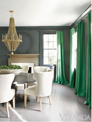
If you are brave enough I say do the whole room in a deep hue, look at the pic below, the room looks amazing and has a great use of colour. Photographer: Trevor Tondro

Love the above wall colours, especially the green.
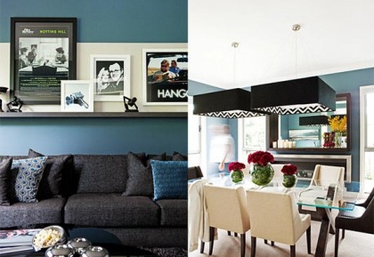
The other way is to paint 1 wall, now I know feature walls are a thing of the past but I say if it works why not, I agree that the B&Q wallpaper feature walls have been done to death. I say try painting the room a darker hue with a wall in a block colour or you could try small areas like the back of shelves, in pic below I think it totally transforms the space and stops the simple shelves looking dull dull dull and showcases the items on the shelves so much better don’t you agree!
 Photographer: Trevor Tondro
Now the other way is block colour on furniture, in the shop we have a small chest of drawers fairly traditional in style but painted out in a deep hue which makes it look more up to date and far less stuffy, sort of puts the fun into it! Now try adding an item of furniture in a bright colours but remember to restrict the colour pallet, u don’t want lots of colours fighting to be the star, pick one bright colour then others more paired down and ones that fit in with star colour, maybe add one other contrasting one! U can also block colour armchairs which is a great way, at the moment I love this orange fabric by mark Alexander, it’s also got a great texture, it’s going to feature in the shop soon and make its way into my new casual lounge! When I get chance to do it, still haven’t started the bedroom!! Whoops..

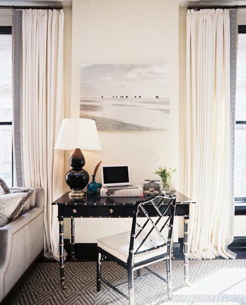
If this all seems a little scary try ping this in a small room, ensuite or cloakroom or a strip behind a desk would work well and is perfect starting point.
( Images from Rue, Real Living & Lonny Magazine)
Have a great day!
Curtains
August 23, 2013
Sorry guys a bit slack on getting the post out this week, just managed to finish it so here you go.
Thought I would talk about curtains. It’s one of those items a lot of people will spend money on but get it wrong and you will have to live with a costly mistake! So I thought I would give you a few tips.
Tip 1, If you want to live with them for a while go for simply, I always blend the curtains in with the walls, for me it’s more about texture than pattern.
Tip 2, Simple heading, I always always opt for cartridge pleat heading as it looks really simply and elegant when drawn, almost like it’s just neatly looped back.
Tip 3, If budget allows go for interlining the curtains which is like sewing in a blanket inbetween the fabric and lining, it makes them look so luxurious
Tip 4, If you don’t want them too plain go for a simple pattern, we have a small patterned fabric in the shop, we get so many compliments about them.
Tip 5, Add a texture to a plain fabric like a soft velvet band across the bottom, main fabric in say a linen, a great way to have plain curtains but adding interest without going for a bold pattern, this could also be a good way to add a plash of colour
Tip 6, My favourite thing to do is add tape trimmings, adds interest without over doing it.
Tip 7, If you have’t got big budget go for sheer fabric curtains as they are so much chepaer to make and you only need to buy the sheer fabric as no need for lining etc. This will still soften the room but won’t totally block light out so there may be need for blinds or use in a room that you don’t want to close off from the rest of the world
Tip8, If you are brave, go for a bright jewel colour, get this right and this can look amazing! much harder look to pull off and you really need to have the rest of the room nailed with the furniture etc as you don’t just want to walk in a room with the curtains being the only feature, this will make the rest of the room look dull as dish water.
Take a look at these pic, Loving the green curtains, thinking I need to do this somewhere at home. But where is the question!!

This is a pic from my shop (excuse the poor photo taken on my iphone) and explains tip 1, 2, 3 & 4

Above pics show curtains (tip 5) with bands added on the bottom and the right hand side photo shows adding a contrast leading edge, just a adding a little ping of colour stops the curtains looking to plain!
Add pattern tape to edge of curtains, totally transforms them and a cheap way to add a bit of interest, Tip 6

Tip 7 which is great for budget option, sheer curtains, pick the correct hue and they can look great!
And if you are brave go for a bright colour, love the curtains in the pic above still simple but very effective. Note you either have to have an amazing room or great furniture to pull this off to it’s full advantage. The grey walls work perfectly!
Have a great weekend guys!
Entertaining in style!
August 13, 2013
Sorry for lack of post last week, went on a mini break to cornwall for 3 days and it rained solidly for 2 of them!! Think we picked the worst weekend of weather we have had for weeks!! typical!!
Seeing as it seems to be the season to entertain I thought I would talk about styling your dinner table! And seeing as we have had hotter weather we are entertaining more outside!
you’ve got to think slightly outside the box, you don’t have to have a wad of cash to make a table look more inviting it’s the simply things that can make it look intriguing. My most favourite thing is adding flowers, it could be as simple as adding a row of jam jars filled with blooms down the centre of the table. I also use candle holders as they are like mini vases! the next thing is adding a runner or table cloth, I always use an off cut of fabric or simply buy a couple of metres of fabric as the choice is so much better than trying to find a tablecloth. I then just fold it usually like a runner and go for something dramatic, especially if you have white simple crockery, this will make the table far more interesting. I love the bold stripe one in the pic below or even just a bold colour looks great.
When adding flowers I would use this opportunity to add that all important splash of colour. Another great little thing to do is adding tea lights dotted around, I almost like a tea light per guest. If u get the table cloth and flowers right I like to keep the crockery simple, I personally think too much crockery on a table can make it look cluttered. Once the table is clear you still want it too look great so it’s important to get the look correct without the crockery! One of the key things is contrast, contrast between the crockery and the cloth! I love the black plate in one of the picture and gold is making a massive comeback and looks great within the table setting.


Above is one of my favourite American designers Kelly Wearstler who is a master at setting a table and uses objects and sculptures to dress the table.

Right that’s it from me! I have included a few pics of a dInner party we hosted earlier this year which was featured in the crumbs food magazine! luckily one of my friends is a private chef which obviously helped! don’t do what I did and decide to paint one of the walls the night before!! Crazy!!
http://www.crumbsmag.com/journal/253_the-supper-club-table-talk
Have great day!
Quick fixes!
August 1, 2013
Right really got to get my act together with sorting out the house, got friends staying in a few weeks and the downstairs room that used to be the office needs transforming back to a casual lounge but have a stag do and a trip to Cornwall in between so not much time to do it, will give it a go at least!!
With this in Mind I thought I would talk about quick fixes but on a budget! So guys the most transforming thing to do in a room is painting the walls but op for a more striking look, just dare to go that bit darker it will transform the space in an instant, I’m going really dark almost charcoal grey!! I’m going add lots of pictures which breaks the space up and will give the walls depth.

My next tip is add a graphic rug, you can get some real bargains out there try urban outfitters and ikea, I’m going for a black and white version which will be dramatic, always need a bit if drama I say!!

Tip 3, add shelves as this really breaks the Space up, the floating ones from ikea are as cheap as! I’ve put 2 together wall to wall so they look like they have been made to fit, I had to cut them down a bit so u may need a saw or someone handy but worth it as they look so much better. Also another tip is paint them out the same colour as the walls. Now this is we’re u add your personality, so layer the shelves with books pictures lent up overlapping each other, the odd ball ornament will finish it off!!

Now adding the furniture is the hard part mainly as its the biggest ticket priced item so if budget allows for new pieces great if not (like us) I’m just adding a new coffee table I’m going for a reclaimed one which breaks up the look as everything else has cleaner lines, always good to mix it you don’t want matching furniture it will look boring! I’m still going for some simple modern cabinets from ikea for the tv unit again cheap and the same trick as the shelves add some together to fit within a space makes it looked built in, which didn’t cost much but looks like it cost a buck! If budget can’t stretch to new sofa or chairs u can hunt for some second hand ones but in my opinion this can take an age to find the right look and a bargain, to juzz up an old sofa u can add throws and lots of mix match cushions, try jewel block colours for this as its on trend and if budget could stretch to new chairs do these in a block bright colours it will throw the whole scheme off balance, which us a good thing. Remember to limit the colour palette you don’t want too many colours as it will then feel wrong. Don’t forget, get the rug right and this could be the winning piece that will help with using existing furniture as it will distract the eye away.

Happy decorating!
Small spaces!
July 25, 2013
Thought I would chat about small spaces and in my opinion the easiest spaces to design as it’s more restrictive so not so many options to look at!! I sort of usually nail it in one hit but for most people they struggle with knowing what to do. This is down to the main focus being to make the space look bigger……wrong! Design it like any other space, firstly what is the room used for and then fill it, yes fill it with what is required. Don’t be afraid to use normal size furniture, one of the biggest mistakes is using teeny weeny pieces of furniture, it ends up making the space look wrong. A key elements is storage, if the budget allows a clever use of built in storage is great, lets say shelving unit going up to the ceiling for instance and wall to wall! A cheaper alternative is joining shelving units from ikea!
Almost everyone I talk to paints the walls pale, for me it’s a myth that pale colours make the room look bigger, it’s what you do with the space itself that counts!! so painting the walls darker will for sure give it a cosier feel but it won’t make the space look smaller, it will be far more interesting than boring pale walls. It’s then how you dress the walls, say one wall of storage then fill the other walls with pictures, a trick is to hang the pictures (lots of them) from floor to ceiling and add mirrors as the reflection is so much more important to make a space look bigger than going for pale walls. Another trick that I have done many times is hanging blinds from the ceiling hiding the wall above the window, this elongates the window and gives the illusion that ceiling height is bigger. Painting the ceilings the same colour of the walls also does the same thing but I know this is a scary move as many are afraid of bringing the ceiling down! but it does the opposite as it stops you from looking at the ceiling and doesn’t bring your attention to it. If this is too big a step, try jumping down a shade lighter for the ceiling.
And the last thing is using larger items, not all the pieces but at least one, my favourite is an oversized lamp, it will enlighten the eye and make you think this belongs to the space almost tricking the brain into thinking the space is bigger than it really is.
Some pics below, all mainly of New York pads as there ares o many bijoux apartments but the interiors are very cleverly designed.


Personally I would rather live in a home like this than a massive open plan room with little furniture and no atmosphere.
Right time to sell up and find a small pad! sorry kids!!
Put the intrigue into interiors!
July 17, 2013
Getting In to my spinning now, new spin studio opened which is down the road from me, so a super hard spin class on Monday and maybe one today?, might be able to get 4 exercise sessions in this week. God it’s hard trying not to put weight on! Been exercising regularly for over a year and still not at my ideal weight!! Too much food and wine springs to mind!! Ha ha
Anyway down to business! Designing interiors with intrigue. If u don’t add an element of surprise you end up with a snoring interior, aren’t we all bored of the beige tone interiors out there!!! To make it more interesting add a little intrigue! Now this could be simply by adding an unusual object! Or just doing something which throws it of course!! So if u already have a neutral scheme and don’t want to paint try adding a large scale graphic rug or a mixture of art which could be vintage posters, cheap as chips!! One of the coolest ways is a large scale lamp and even cooler try an Abigail Ahern dog lamp that will totally through the scheme off a little. Pics below show some great interiors, I know not everyone’s cup of tea but break it down and it starts with quite a classic look, use this style of furniture! Then start adding the objects and this creates the interest a bit like adding accessories to an outfit (if your a lady). Get the basics right then it’s up to you how far you want to push the boundaries, this look has no rules so push as much as you want, even if you add a few objects of intrigue it will change the overall look, budget depending of course!! A cheap way is to paint the walls, u can be brave and go a full on colour, harder to pull off or just go that bit darker and this will show off the objects to another dimension!!
 Pics above are similar in regards to items but wall colours are totally different and shows you that having some interesting objects can work in both settings, the colour on the walls totally changes the look and is more individual to the person living there. I think both work well, strip out the interesting objects and the furniture is quite classic…. no!!
 Love this one, I know not everyones taste but I think the use of colour is great, and the zebra rug is what throws it of course as is has a traditional rug underneath!
 One of my favourite American designers Kelly Wearstler is a maestro at adding intrigue to interiors, love her objects, especially the gold hands in the table setting!
 My favourite British designer Abigail Ahern and her famous dog lamps! Might get some of these in the shop!!

And even if it’s a small item like this elephant book holder, it still does the job perfectly, much better with a dark background!!
Sorry guys lots of pictures today! Pics courtesy of lonny Mag and Abigail Ahern Pinterest!
Happy Wednesday everyone!
Black is so under estimated
July 11, 2013
Not a great start to the week, think I was out in the sun too long on Sunday and was ill the start of the week, feverlike!! Talking gyberish in my sleep (no change there then I hear you say!!) But it’s so nice to have heat it’s just too tempting not to stay outside. So becasue the weather has been so good the bedroom has taken a back seat, and it’s not going to get started for a few more weeks as away the next couple of weekends. Hopefully will take a few days off in the summer to finish it or even start it!!
Today I thought I would talk about the dreaded colour black, in my opinion one of the most under estimated colours and in my book one of the most importmant. Use black in the right way and it can totally transform room, picture, acessroeies etc etc, it literally works with all things. At the moment I am a fan of black walls, I know, I know I can hear you all saying yuk isn’t it a bit gothic and depressing but I don’t think so, get the correct hue of black, not too dense almost a nearly black (F&B do a great one called Off Black) or if not a very dark grey will work just as well. Best place to try this out could be in a hallway as this is a space you don’t spend all your time in. It could be just one small wall at the end of a hallway, a few pictures plonked on the wall and you’ve created a great little feature. Another great way of trying out a black wall is in a Kitchen as a blackboard wall, you can get blackboard paint from any DIY store. You could always paint it as a strip from floor to ceiling if you haven’t got a small wall.
Another thing for me is black floors, I love them as I think it makes all the furniture look so much better, almost acts as a stage and contrasts so well, rather than blending in and looking boring, definitely going for black floors down stairs when I refurb (which could be a while).
If your not brave enough to use black on the walls or floors you can use it pretty much everywhere else, lamp shades a good one, picture frames (for me they contrast against the wall beautifully) A tray on a side board with accessories on, or simply one small piece of furniture like a side table would work really well. Take a look at the pictures below, I hope you agree that the black is what makes most of these interiors.

Blackboard wall, perfect if you have a recess area like this, and compliments the black kitchen cupboards

I know you have seen this pic before, but perfect explanation of how good black can look in an interior, not just on floor, windows, shelving unit and the sculpture on the table works a treat.

One of my favourite pictures and I keep using it but the black wall with all the pictures looks great, the pictures break it up perfectly. And if you are daring enough the pic on the right has all walls painted!!


Another thing on my list is having black kitchen cupboards, love the left pic which is one of my favourite American designers Nate Berkus, the units where previously white but look so much better in glossy black, much more sophisticated.
Now go paint something black!!
Have a great sunny day!
Art on a budget!!
June 26, 2013
Well my bedroom designs/decorating is coming on slowly, I still slightly undecided on which colour to paint the walls but have managed to sort out the furniture from pinching a table and lamp from the lounge which has already transformed the space and have pretty much decided about curtains and fabrics etc. I also had 2 frames with very old sketches in, which were a little dated and looking a bit too traditional for my taste, so I have decided to paint the frames an off white (because I’m going dark on the wall I’m thinking light frames to contrast and break up the colour) and I simply and very quickly drew a geometric pattern in shades of grey on the computer and replaced the existing print, it’s completely changed the look and cost me nothing (already had a tester pot of paint I used) and just a little but if time! easy…no!

So I guess this brings me on to art, it’s one of the hardest things to pull off but it’s also one of the things that totally transforms a place. I say mix it, modern art, photography, oil painting…..anything goes. Try limited the colours as otherwise it could look like a miss match, 3 main colours within the collection will work best. If you have a load of cash this obviously makes it easier but believe you me it’s still hard to get it right. Sometimes art on a budget works better! as your more up for taking risks! Some tips on getting art on your walls without it costing a fortune is look at poster sites, (try http://www.allposters.co.uk) you can get some pretty dam cool posters for under a tenner, then frame it simply. I love the vintage travel posters! Another one if you have time is going to car boot sales and flea markets, not an option for me as I just don’t have the spare time so printing off a picture I can find on the internet is a much quicker options! Or create simple geometric patterns as per my revamped pic below, or greeting cards and postcards are a great inspiration, I have scanned many in and had them printed at the local copy shop and framed them. And another great idea is framing wallpaper and fabric (which is like art these days).
When hanging these on the walls, mix a few photos in, I say casual family snaps. I took a photo of a cathedral in Reims which was a great architectural picture but by the doorway was the wife and kids, you could hardly see them but it gives the photo so much more meaning. I printed it off A2 size framed it and you wouldn’t believe the comments I get about it!
Take a look at some of the pictures below which should explain what I’m going on about.

A mixture here, some sketches a photo and modern art

All photography in this one but play with the scale and it totally works!

All sorts of art here, an old magazine cover but in some great frames, and in my opinion the pictures on the dark background rock!

So cool! the surfer dude’s pad!!
Hopefully by the next post I will be a bit further on with the bedroom and will show you a snippet of the colours and fabrics chosen.
Happy Thursday!
Putting it off!
June 19, 2013
I have nearly fully recovered from the man flu! so back to a normal this week. Got to get into a regular exercise regime otherwise I’m going to turn into a fat blob. When you do get into exercise it’s funny how you miss a week and almost feel guilty, never thought I would say that!! almost feel off my chair thinking it!!
I’m still thinking DIY this week, I have so much to do on my own house, I have sort of been putting it off thinking I will wait until I can buy that amazing piece of furniture etc, which I guess most of us do but I could be waiting a long time with the money that gone into the shop there is no budget for the house!. So it’s going to be designing on a shoe string and I’m thinking of basing some of my posts on the rooms I need to do.
First up is the Master bedroom, It’s going to have a paint job, so all walls and skirting’s are being painted out in a dark hue. We do have a sort of headboard which is wallpapered in a textured copper finish. If the budget could stretch I would re do this but it’s going to have to stay! The next main thing and something I have wanted to do for ages is painting the wardrobe doors, at the moment they are a light birch colour, yuk! They are melamine so this will be a quick fix as in time the paint will chip, they will get replaced when the wallet can cope! . A couple of simple side tables will also get painted. I’m sort of hoping the wall paint will be the main transformation of the room, as we are going dark we will need to break up the walls and space which I will do with large pictures, mirrors, and a wall of curtains which is going to be my biggest cost and something that is at the top of the list as it will make the room feel more cosy. It’s a newish house so no real features, If you have amazing windows sometimes leaving it simple works better! Then the final touches will be adding the interesting objects, nice lamps, will probably splash out on at least one nice lamp as this can totally change the overall feel, especially if you go super sized! Add a few vases with some greenery, books piled up, that sort of thing. You want to make the room feel like it’s lived in without looking messy. So a great little tip is plonking all your daily items like cosmetics etc on a little tray, it sort of keeps it interesting but tidy! And finally I will be hunting for a small rug to break up the carpet which is a bit bland, I’m thinking zig zag!!
Heres what I’m thinking for the wall colour, a bit risky hey!!

And a pic to show you what I mean about a tidy mess!


Have a great Wednesday!
